5 Tips for the Best Customer-centric Web Design

Customer-centric design is psychology expressed through design: start with empathy, then shape content, structure, and flows around real user needs. Match messages to well-researched personas, show proof and transparency to build trust, and make value obvious at every step. Prioritize function over flair so navigation, CTAs, and mobile experiences feel effortless, and only then layer aesthetics. The shift: design for understanding and outcomes, not decoration.
Is customer-centric design more a matter of psychology or design?
Um, we've done a lot of research on this and found that: customer-centric design is psychology poured in and over design. To put it that way. Because we are all humans (still), web designers should never get that off their minds while creating.
In her book "Everybody Writes" Ann Handley (annhandley.com) says:
Develop pathological empathy for the reader.
Well, we think the same goes for designing websites.
So, develop pathological empathy for the user (customer). That is what, in essence, makes the best customer-centric design. But if we break down that essence, we will find many elements that could help us build such an empathic customer-oriented website. We've listed some of those for you. Down you'll find tips that will make your website all about your customers! And the most important thing is that they are satisfied, right?
Web design tips built around your customers' needs, interests and behaviors
1. Match your message with your buyer persona
Text, images, and videos on your site should speak the language of your target audience. That means you should (always and forever) research the target audience and the buyer persona of your products & services.
To get to know who your audience, you need to find out who your people are. For a start, ask yourself:
- What do they like to do in their free time?
- What and who do they follow on social media?
- What kind of music, books, and movies do they enjoy?
- What are they passionate about?
- What universe do they belong to?
Then, make your content part of that universe. Be it an image, infographics, or explanation video, it has to be delivered in the style and language your audience likes to see and hear.
This you do for RESONANCE with your audience.
2. Do not hide anything from your buyer persona
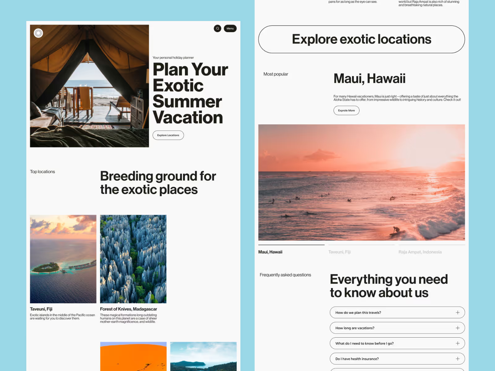
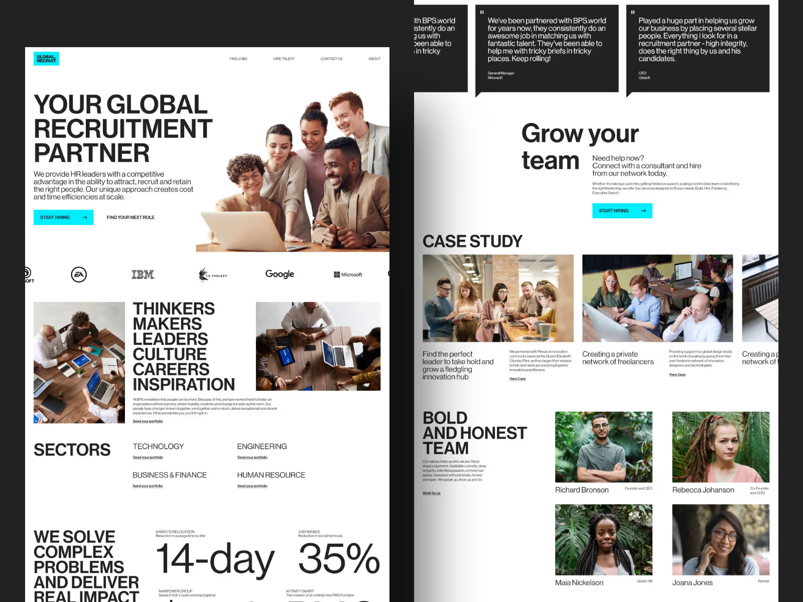
Build trust with your customers by displaying content that honestly shows you. Products, services, work ethics, team, company history, everything should be right in front of the customer's eyes. We like to repeat, but - people never complain about being too informed. Right?
Above all, even getting your services, people want to feel safe and sound. In other words, If they are gonna buy something from you, they would like to know as much as possible about your insights. Designers who have that in mind hold a powerful tool for building trust between the owner and user of the website.
Here, special value to customers has honest feedback and recommendations. Here is what they would like to see on your website:
- Testimonials, reviews, and badges
- Photos of your team (so they know who is behind the company)
- Personal and company history info
- Real photos/videos of your products & services.
- Feedback, happy buyers, comments on your business, etc.
This you do to BUILD TRUST and BOND with your customers.
3. How your service or product makes their lives easier
Point out the value of your products & services on every corner of your website.
Many users get to your websites not just to look around but, to get their problems solved. And you should strive to do that before everything else. Solving a problem before trying to sell to people has become a formula for fair business running. It should definitely reflect on your website.
How can you offer the solutions?
First, find out what people struggle with the most. Then see if your business is in the niche that can help. You can easily find online what your buyer persona writes about their problems. Then you can give the answers and solutions to that on your super helpful website!
Explain, educate, and describe how exactly buying something from you would solve their problems. Give examples of your projects that already helped people in the past. Show photos and videos of how your product benefits people and why you believe in it. Then you don't even need this selling part so much. People are convinced to pay for the honest display of things and solutions. They will buy your product because you've shown them it's the key to making their lives better.
You do this to give real VALUE to your customers.
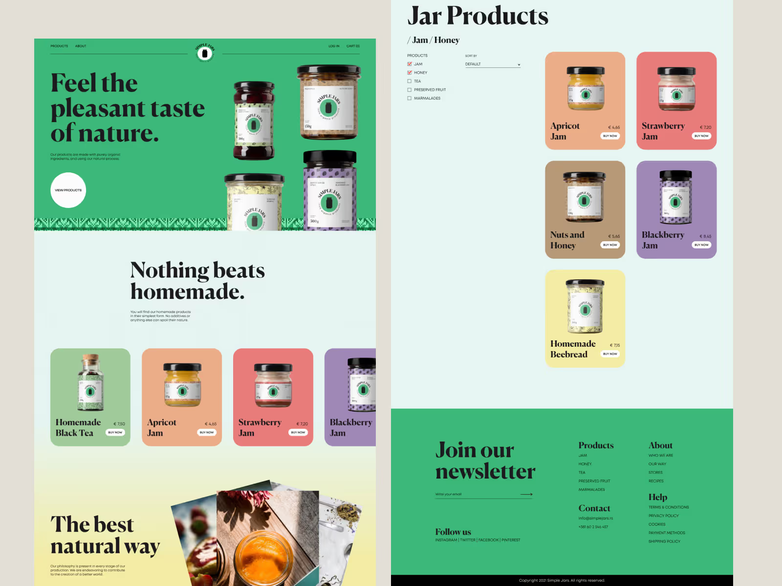
4. Designer always favors functionality over aesthetics
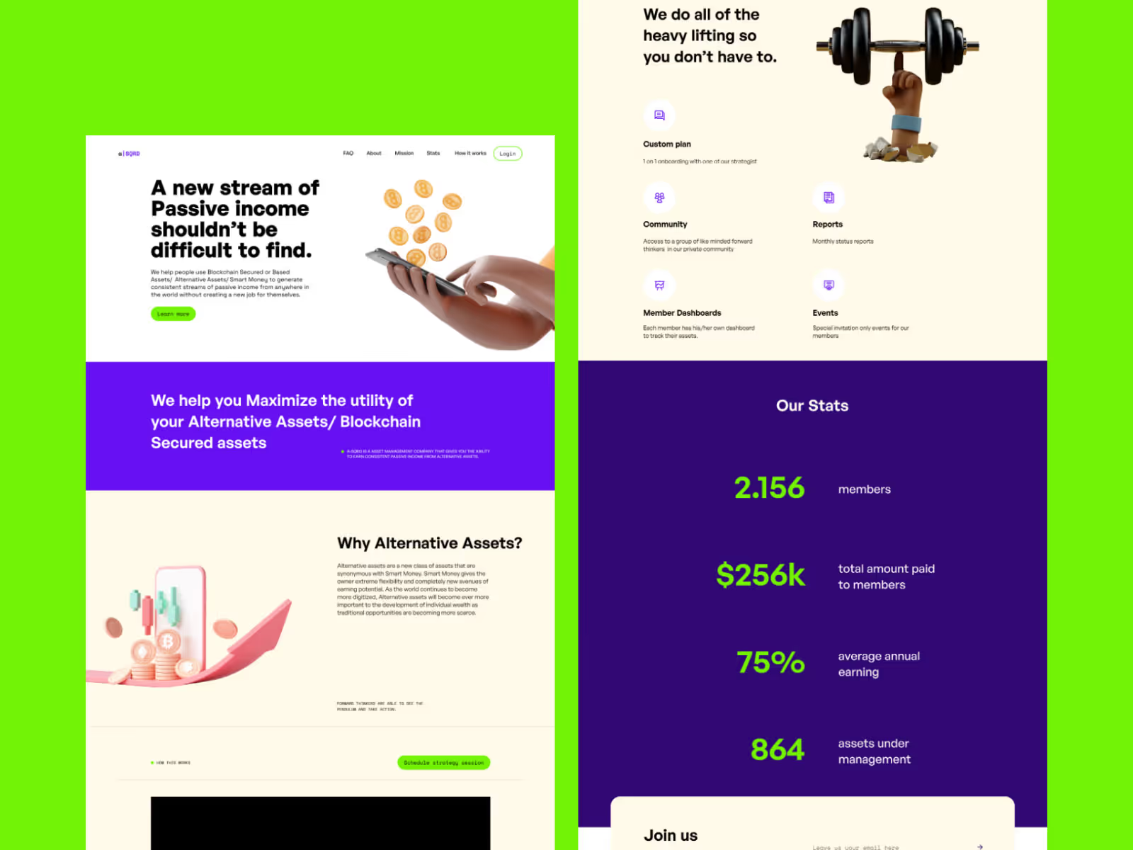
Just as the customer first comes to you to solve their problems, you should get them there as quickly as possible. That means that sometimes you'll have to silence your urge to design beautiful artistic visuals and choose the cleaner and plainer design instead. Because customers want to see the relevant info clearly.
If your design is burdened by content, different media, and heavy copy that have no vital role, it can distract people. Since they do not like to search for too long for the solutions you say you offer, they could just drop off. No matter how awesome it all looks.
The best way to prevent this from happening is to focus on the clean and non-confusing look of your website. Make sure:
- The overall appearance is clean and easy to process
- Your CTA is visible from the space
- Your messages are direct and unambiguous
- Your navigation and guidance are smooth
Explain every step of the way as people commence their search. And don't stall it - take them to what they want to see. Don't drag your users around on pages they didn't come to see - tour de site is not always a good option. So make sure that your customers can find any page they need anytime and move around quickly.
Bonus tip: Make it all mobile-friendly - always. A lot of customers actually browse via devices like mobile phones and tablets. Therefore, everything said about the clean & clear design overlook also applies to the mobile version of the site.
You do this for ACCESSIBILITY and READABILITY.
5. Make it a good experience
This one is about aesthetics.
When you're sure that all the previous customer-centered features have been added to your site, it's time to integrate them into an aesthetically appealing design. We are not saying that the functionality of the site and the attractiveness are so separate. On the contrary, those two features intertwine. But when you want to express your brand or style on site, make sure it doesn't jeopardize the user's journey.
So, nothing confusing, heavy, and hard to process should be there, even if it looks so great. We know, the sacrifice is sometimes big, but you are not making a designer-centered website, but a user-centered website. Don’t forget that.
Note: If customers (your buyer persona) happen to be into confusing, heavy, and challenging design, then you should design a site that way. Then all that hard-to-process stuff would again be customer-centered. So, pay attention and read the first tip again.
In fact, a good practice is to make every step on the site a wonderful experience for the user. Use every design feature to make it striking and hardly forgettable for any visitor. They are thankful for functionality, but they will remember you by the overall impression of your website.
You do this for GREAT EXPERIENCE.
There, you've got some tips and tricks straight from a ninja's pocket.
To sum up, customer-centered design features are:
- RESONANCE
- TRUST AND BOND
- VALUE
- ACCESSIBILITY AND READABILITY
- GREAT EXPERIENCE
Analyze these tips, try them, and implement them.
And when a user finally says “This was super useful and super fun” - then you have created one great customer-centered website.
Cheers!

.svg)
.svg)


.svg)
