Figma to Webflow - The best duo on the market
There are so many tools used by designers, such as Sketch, Invision, and Adobe XD, but Figma is here to replace them all.
The rapid growth of technology affects many areas and industries, and because of that, design is constantly evolving and changing. None of the tools mentioned above didn’t even exist a couple of years ago, so designers were left to improvise and most of them, including myself, used Photoshop for web design. With that in mind, we always need to stay on track with the tech trends and think about the future of design.
Another tool that got designers' attention is Webflow. There were tools like that before, such as WordPress and Wix, and even more, tools came after, but Webflow is something special. It has the potential to grow a lot and since it’s a no-code tool, in the future, we can build web and mobile apps without writing a single line of code.
In this blog post, our focus is both Figma and Webflow - why we use them, what features we love, and what is our process of transferring Figma design to Webflow for a perfect website structure and easier development.
First things first, what is Figma?
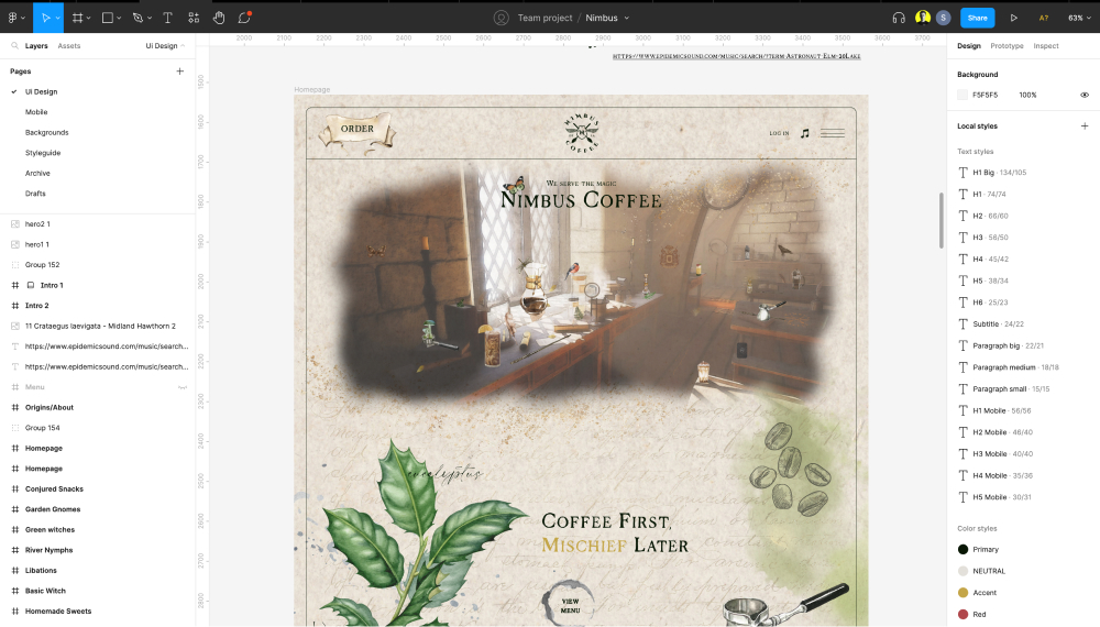
Figma is a relatively new tool (launched in 2016) that is rapidly replacing all other designer tools. It is both web and app-based (both Windows and macOS), which means much simpler project collaboration and working on different devices. In Figma, designers can create UI, UX, and prototypes, and collaborate with other designers while working on the same project.
Ok, and what is Webflow?
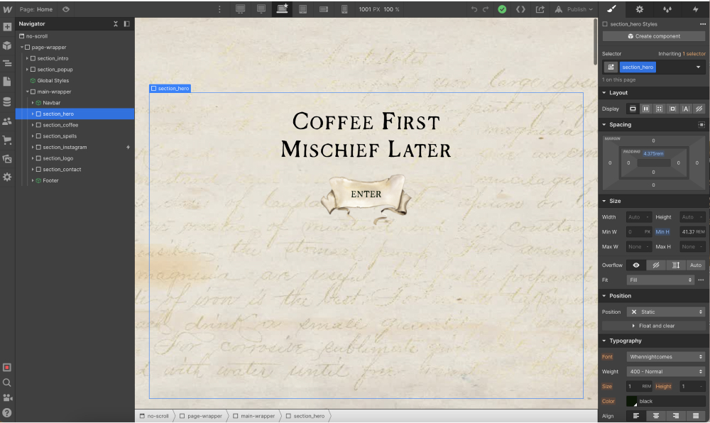
Webflow is a bit older than Figma (launched in 2013), but still a new tool and without a question of the first no-code tools on the market. It is maybe not the most used no-code tool, but it’s the most innovative one. They have a user-friendly design panel, progressive interactions that no other tool can use natively, and no plugins.
This year they also introduced “Memberships” which enables the creation of web applications, and new and improved ways of collaboration and working at the same time, like Figma, a new logic system where you can create more complex integrations like quiz, which was not possible before without a custom code, and many more.
A new way of working
Design and development have always been collaborative processes, especially during the discovery of new ideas and the handover process.
At Broworks, we combined our UX design sprint with project organisation and Webflow style guide structure. We do that by structuring layers, creating a style guide, and preparing everything for export from Figma. Then, we import everything to Webflow, compress it, create a style guide with the “Client-First approach” from Finsweet and develop all the pages.
Figma preparation
After the UX design sprint is completed and we have a clear understanding of what’s going to be on a website, the next step of our process is creating a high-fidelity mockup (UI design) before testing and Webflow development.
Creating hi-fi mockup goes like this:
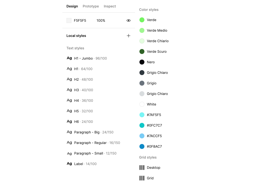
- Creating colour palette, text, and grid styles - This is one of the first steps of organising Figma that will help both the designer and the developer to build the website, by applying all styles.
- Creating components for elements that will be reused - Navigation, footer, buttons, forms, blog posts, etc.
- Grouping and labelling the layers - This is important for developers to find their way around in Figma design later.
- Consistent use of margins and paddings across the design - It’s really important to double-check if all elements and sections have the same spacing between them. That will help developers not use too many classes in Webflow and make the website better organised and lighter.
- Reusing elements - Another obvious thing, but many junior designers don’t do this. It’s important to try reusing as many elements as possible across the design. This will make the website more consistent, organised, and better for user experience in general.
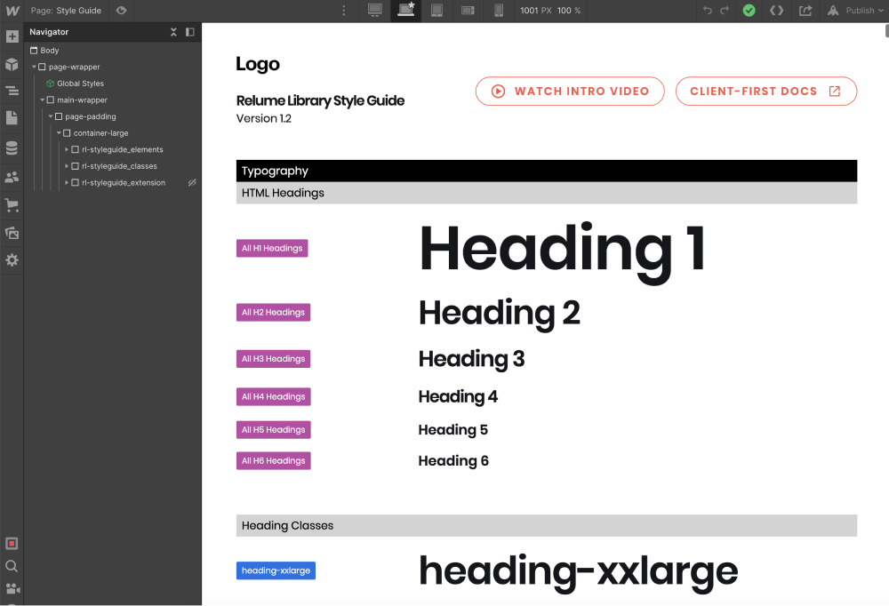
- Creating style guide - The best approach is to create a new page in Figma and add all the elements that have hover effects, any kind of interactions, rich text, and form submissions (success and error messages). This is a must thing for Webflow, so it’s better if the designer prepares this on time for development.
- Preparing for export - The last thing is to create Favicon and Web Clip images, prepare WOFF or WOFF2 font formats (since they are the least heavy fonts to use) and only styles that are being used not the whole font family, and export and compress all the images that are used in design in original format. Some images can be in a clipping mask, so it’s better if the designer prepares it in the original format for a developer to work it out in Webflow, unless they need to stay in that specific shape.
Webflow preparation
When the design is ready for the handoff and both the designer and developer had a meeting regarding their process, the developer is ready to start preparing his project.
The Webflow preparation process is going like this:
- Import everything - The very first step is to import everything to Webflow, from font styles in appropriate formats, to images, videos, Lottie files, SVGs, favicon, etc.
- Edit style guide - The next step is to prepare your style guide. I suggest using the “Client-first approach” from Finsweet, since it’s the best style guide there is at the moment. There you can edit your classes for every single use, of course, you’ll have the custom ones that can be added later in the development process.
- CMS collection, Users, E-commerce - It’s a great thing to create this before the actual development of the pages since it will be much easier to see how things actually look in the building process. So, my advice is to add all things before that.
- Building process - Now you’re ready to start building pages. You can start with the homepage and later do the other pages, but there is no strict rule on where to start, that’s your choice. It is also a good practice to take care of responsiveness across all devices while building it for the desktop since it’s much easier. At this stage create components, just like they are created in Figma, to make things easier to reuse on other pages.
- Website Interactions - Some people prefer doing this during the development process, but sometimes things can be messy since you don’t have a clear view of the whole page or project. My advice is to at least build the whole page, if not a project, and then do interactions separately. Element states, like hover, pressed, and focused can be done during the development process too.
- SEO setup - This is the last step of the process before QA. At this stage make sure that all images (JPG and PNG) are compressed to WebP and alt text is added, title tag and meta description are added for all the pages, as well as Open Graph images. All unused classes are cleaned up in the “Style Manager” tab. Google Analytics, Facebook pixel, and all other integrations are added.
- QA - At the final step of our process, test website accessibility, page speed, responsiveness, and how it works across different browsers (Chrome, Mozilla, Safari, etc). This is an important step to make sure the website is fast and working properly across all devices.
Project collaborations
Right now, Figma supports multiple people collaborating and working on the same project at the same time. Webflow does not have this option yet, but it’s being announced that in 2023 this option will be available as well. This will make collaborations way more faster and efficient across the whole team working on the same project.
Sharing projects with clients or the team
When your designs are ready to test or to be shared with the client, you can easily do that in both Figma and Webflow. In Figma, it’s easy to access links to a project, share live prototypes, and even leave comments, while in Webflow you can also share project links before publishing the website without buying the domain or hosting, it is natively done in Webflow.
What is new in Figma
Figjam
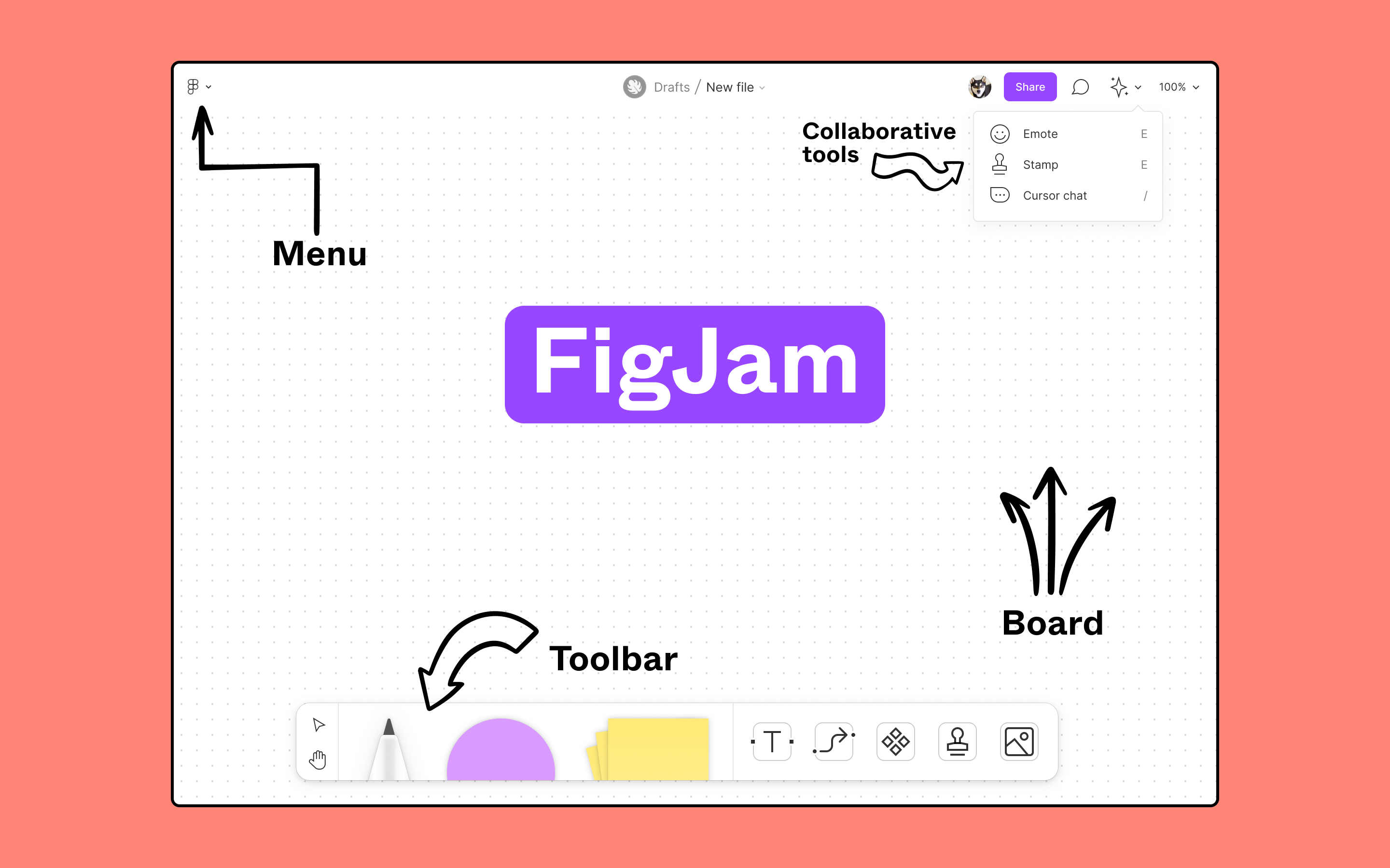
The first new thing we want to introduce is Figjam. Figjam is described as an online whiteboard that makes teams more engaged and focused on collaboration.
Figjam is here to make brainstorming easier and more enjoyable, especially since a lot of teams now collaborate remotely, which makes Figjam the perfect tool for that.
They even offer free templates created by the Figma community that will help you develop your perfect framework.
Other news in Figma
- Figma for mobile
- Leave an audio comment
- Enhanced multiplayer (you can add now up to 500 users on one single project!)
- Figma community
What is new in Webflow
In November 2022 on Webflow no-code conf they announced quite a lot of new things that will be available in Webflow. Some of them are right now and some of them are in beta and live in 2023.
Here are some of the most interesting things that we can have in Webflow:
- Memberships - This option allows you to build user profiles, which means you can now build a web app directly in Webflow. While this option is still in beta, it will be available in 2023.
- Components - We had “Symbols” in Webflow before, but components are much more powerful now since you have more control over reusing elements than before. It is already available to use.
- Logic - This is an awesome feature that Webflow announced since it can be used to build things you could only build with custom code before. That means quizzes for example and more of the complex backend stuff. This option is in beta right now, it will be available in 2023.
- Free guest profile - This is a great option, already available, to add clients to your projects, where they can view your project before handing it over to them.
- Larger eCommerce plans - For all those who use eCommerce in Webflow, this is great news, since now you can have much larger plans to use for your business.
- Branching - That’s what they call it, but it means that you can have multiple people working on the same project. This is also great news, but for now, it’s available only for Enterprise customers and partners.
- Creator profiles - This means creator profiles can now include listings for apps you have published on the Webflow marketplace and it’s available now.
Let’s wrap up
Both Figma and Webflow for us here at Broworks became really important tools in a very short period. The main reason for that is that we can use them both remotely and share our feedback and prototypes with everyone we need to, which is extremely important for us right now.
.avif)
.svg)
.svg)
.svg)
.svg)
.svg)
.svg)


